Spectrum Formatting Macros Cloud User Guide
Spectrum Formatting Macros will always help you to organize and navigate different contents within a single container but now tabs, horizontal and vertical navigation, custom progress bar and "visual" page status are manageable on a cloud version
Our app offers a set of macro as listed below:
| Macro | Description | Screenshots |
|---|---|---|
| SP Tab Group Family | ||
| SP Tabs Group | This macro allows you to add a Tab container. It regroup a set of SP Tab macros. Parameters: Color : dropdown, standard Confluence Theme chosen as default. Use outline CSS: Boolean, used to inverse color. Body: TRUE | View Mode of SP Tabs group and SP Tab Pane macros within its body
|
| SP Tab Pane | This macro allows you to add a Tab pane within SP Tabs Group macro. Parameters: Name: String, Tab pane name Body: FALSE In new Confluence Cloud page editor, it's not allowed to nest bodied macros. Originally, SP Tab Pane has a rich content body in order to put into it content to be displayed when selecting/clicking the tab. Since Atlassian changed its editor (more details about editor changes), we changed how this macro works. Tab content must be added under macro itself as displayed in screenshot 2. SP Tabs Group will parse content encapsulated between Tab Pane macros. Macro content is defined as content that has a macro on its top and a new tab pane macro. | |
| SP Horizontal Group Family | ||
SP Horizontal nav group | This macro allows you to add a Horizontal nav group container. It regroup a set of SP Horizontal nav item macros. Parameters: Color : dropdown, standard Confluence Theme chosen as default. Use outline CSS: Boolean, used to inverse color. Body: TRUE | View Mode of SP Horizontal nav group and SP Horizontal nav item macros within its body
Screenshot 3Edit Mode of SP Horizontal nav group and SP Horizontal nav item macros within its body
Screenshot 4 |
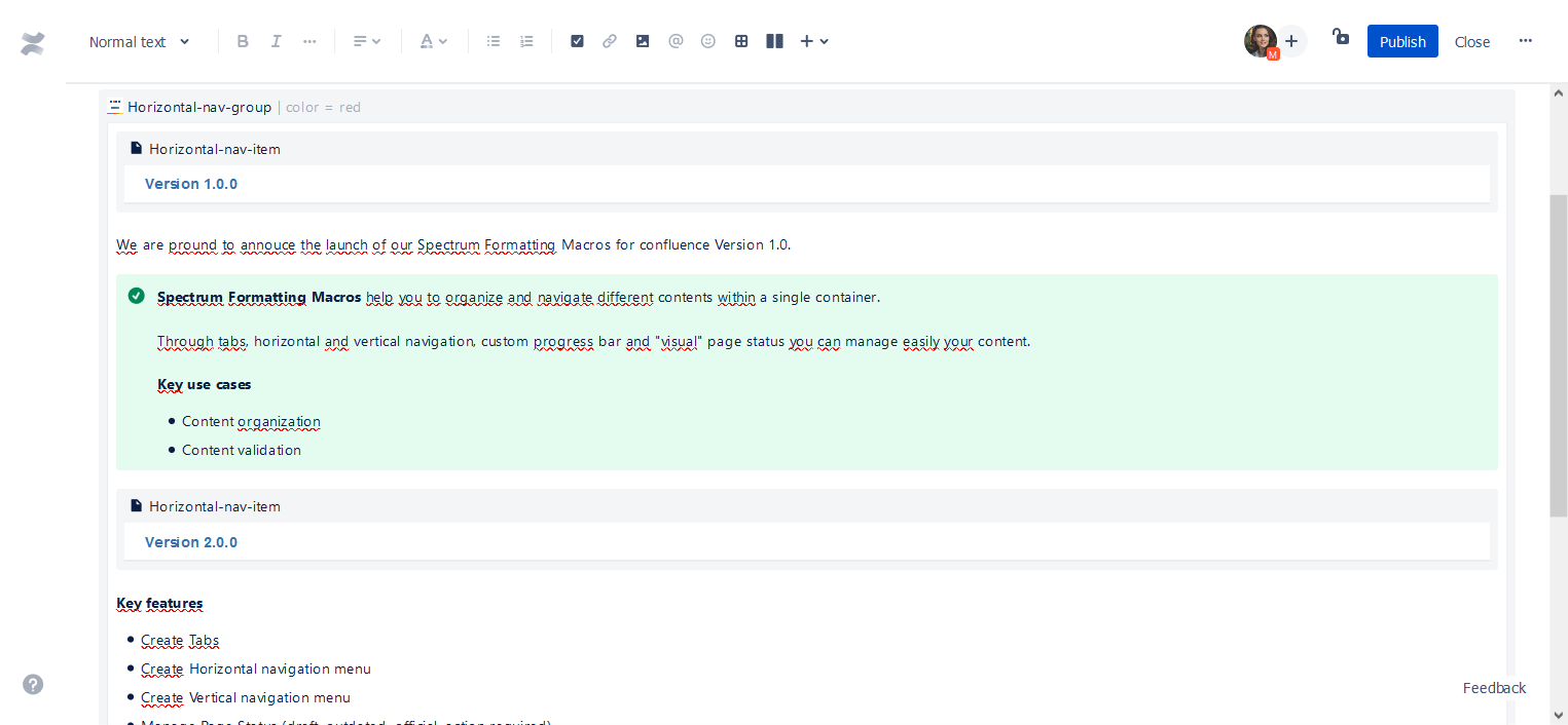
SP Horizontal nav item | This macro allows you to add a panel. Parameters: Name: String, required, panel name. Body: FALSE In new Confluence Cloud page editor, it's not allowed to nest bodied macros. Originally, SP Horizontal nav item has a rich content body in order to put into it content to be displayed when selecting/clicking the tab. Since Atlassian changed its editor (more details about editor changes), we changed how this macro works. Tab content must be added under macro itself as displayed in screenshot 4. SP Horizontal nav Group will parse content encapsulated between SP Horizontal nav item macros. Macro content is defined as content that has a macro on its top and a new SP Horizontal nav item macro. | |
| SP Vertical Group Family | ||
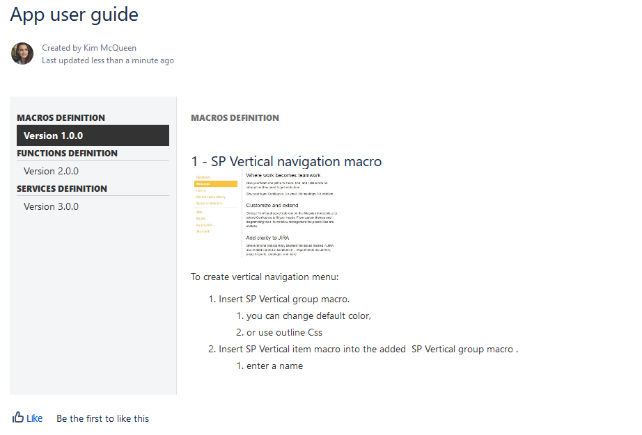
SP Vertical nav group | This macro allows you to add a Vertical nav group container. It regroup a set of SP Vertical nav item macros. Parameters: Color : dropdown, standard Confluence Theme chosen as default. Use outline CSS: Boolean, used to inverse color.Body: TRUE | View Mode of SP Vertical nav group and SP Vertical nav item macros within its body
Screenshot 5Edit Mode of SP Vertical nav group and SP Vertical nav item macros within its body
Screenshot 6 |
SP Vertical nav item | This macro allows you to add a panel. Parameters: Name: String, required, panel name. Header: String, used to add a header as section name before this panel name. Body: FALSE In new Confluence Cloud page editor, it's not allowed to nest bodied macros. Originally, SP Vertical nav item has a rich content body in order to put into it content to be displayed when selecting/clicking the tab. Since Atlassian changed its editor (more details about editor changes), we changed how this macro works. Tab content must be added under macro itself as displayed in screenshot 6. SP Vertical nav Group will parse content encapsulated between SP Vertical nav item macros. Macro content is defined as content that has a macro on its top and a new SP Vertical nav item macro. | |
| Page state macros | ||
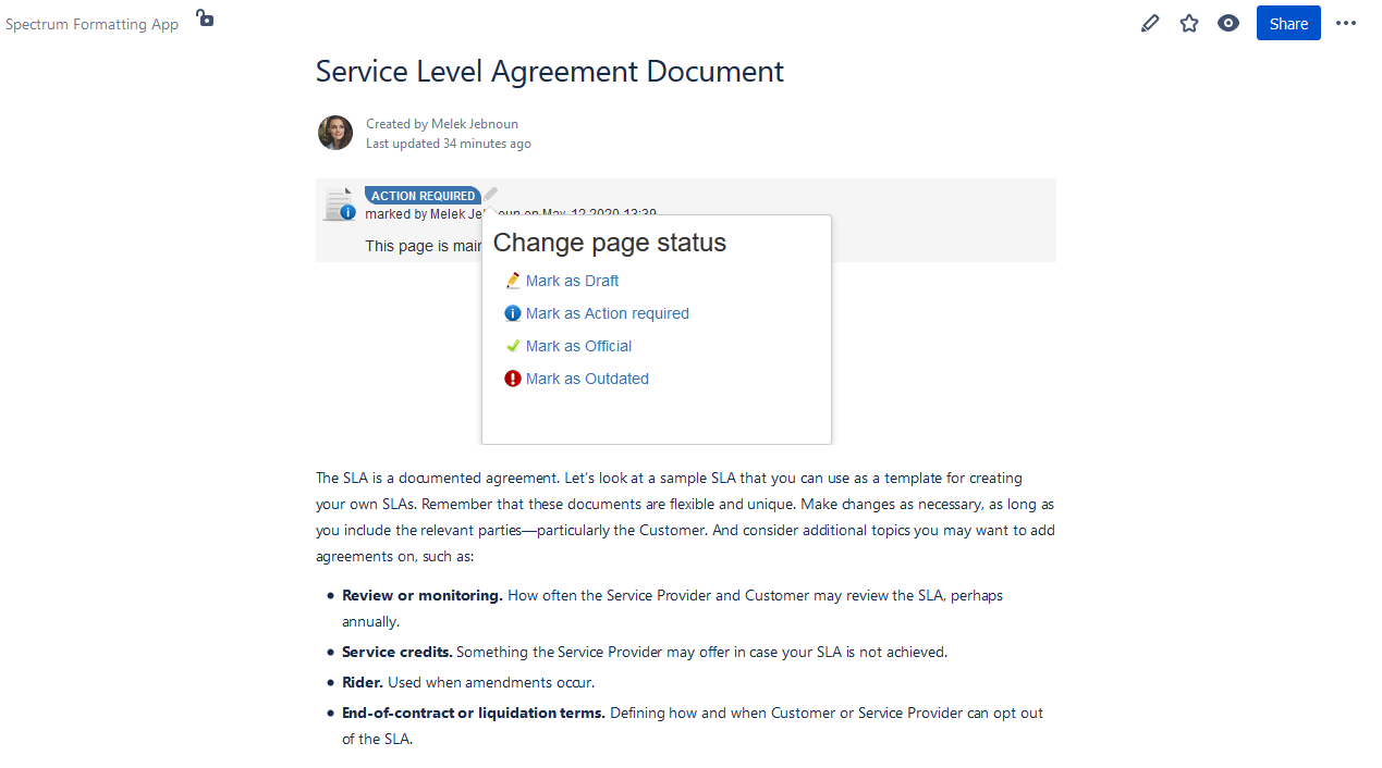
| SP Page status | With Page status macros you can add a status to your confluence page. Four status are set (Draft, Action required, Official or Outdated). Only user who has page edit permission can change page status within this macro. To change status, it's simple, just choose the edit icon beside the page status. Parameters: Additional text: String, used to add text under status box. Width: String, specify custom width. Example: 400px or 50%. Hide "marked by": Boolean, hide the element "marked by user". |
|
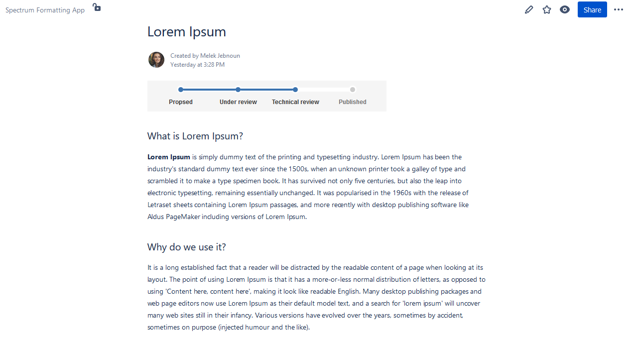
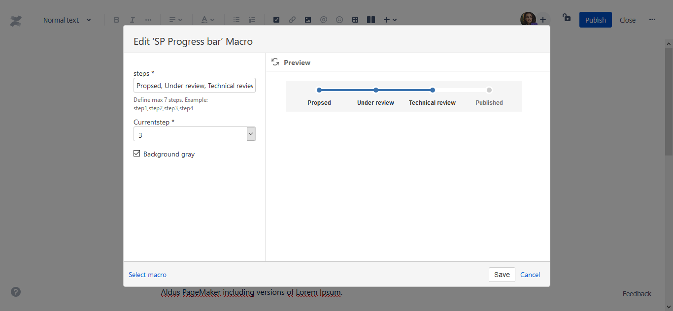
| SP Progress bar | With a custom progress bar you can link your page to a process step. Parameters: Steps: String, required, specify custom steps. Example: step1, step2, step3, step4 Choose current step: List, required, choose current step number. Background gray: Boolean, set a gray background. |
Macro edit mode:
|
.png?version=1&modificationDate=1590054961901&cacheVersion=1&api=v2&width=600&height=277)

.png?version=1&modificationDate=1590054967345&cacheVersion=1&api=v2&width=600&height=277)